

Support measurement sits between two competing pressures: what the customer experiences and what the operation can afford. Track forty KPIs, and you get a dashboard nobody reads. Track the right six, and you can see where response quality is slipping, which accounts are drifting toward cancellation, and which part of the product is generating avoidable work.
Ticket volume alone tells you almost nothing. A sudden spike can mean a broken software release, a successful marketing campaign, or a pricing page that finally started converting. Fast replies tell you little either, because a quick reply is not a true resolution. What support data has to answer is narrower: is this business keeping its subscribers, or quietly handing them to a competitor?
What Makes a Support Metric Worth Tracking?
Measuring every point of customer interaction produces spreadsheets nobody acts on. A metric earns a place on an executive dashboard only when it changes an operational decision or exposes friction that would otherwise stay hidden.
Helps Improve Customer Experience
A metric should reflect what the customer went through, not how the support team feels about its own work. It must capture friction points like long waiting times between replies, re-explaining the same problem to a second agent, or being bounced between channels.
This is not a soft concern. In research CEB published in Harvard Business Review based on surveys of more than 75,000 customers, 96% of people who had a high-effort service experience went on to show disloyal behavior, compared to just 9% of those with a low-effort experience.
Identifies Operational Bottlenecks
Good data points directly at structural weaknesses. It should distinguish between a delay caused by understaffing at 2:00 AM, one caused by an agent lacking permission to issue a refund, and one caused by engineering sitting on an escalation for three days.
All three look identical in an average resolution time figure, yet they require completely different operational fixes.
Supports Business Decisions
Support data belongs outside the support organization. Ticket trends give finance teams a defensible basis for headcount planning and give product management clear evidence about which features need redesigning or better documentation.
MetricNet tracks tickets per user per month for exactly this reason. It turns raw volume into a reliable planning number.
Can Be Measured Consistently
A metric is only as good as the underlying data. Anything depending on agents remembering to tag tickets correctly will drift over time.
Automated logging inside the helpdesk keeps historical trends comparable, and clear definitions matter just as much. If first contact resolution means one thing in January and another in June, the trend line becomes fiction.
Leads to Actionable Improvements
If a number moves and nobody knows what to do about it, that number is merely decoration. Useful metrics suggest their own corrective action.
A concentration of tickets in one category after a release points directly at a specific build. A sudden rise in reopens after a policy change points straight at the policy.
Response Time Metrics That Shape the First Customer Impression
The first exchange sets expectations for everything after it. Customers writing in are usually already stuck, which is why the gap between receiving an automated ticket receipt and having a real human look at the issue carries immense weight.
First Response Time
First response time measures the delay between a customer submitting a ticket and an agent sending a genuine human reply. Automated acknowledgements should never count toward this calculation.
Long wait times create the impression that an issue has been dropped, which frequently generates duplicate tickets. This creates extra volume caused entirely by silence. Staffing levels, time-zone coverage, and routing rules drive this number far more than individual agent speed. Sudden spikes almost always trace back to an outage, an unexpected release, or a demand surge nobody staffed for.
Realistic targets by channel show distinct operational expectations:
- Live Chat: The median first response across industries sits at roughly 1 minute 35 seconds according to Tidio benchmark data, with SaaS slightly faster at about 1 minute 22 seconds. Under 2 minutes is competitive; under 40 seconds is exceptionally strong.
- Email: Zendesk frames its tiers as 12 hours or less being acceptable, 4 hours or less being better, and 1 hour or less being best. Most teams fall behind, with EmailAnalytics putting the cross-industry average at 12 hours 10 minutes.
- Enterprise SLAs: Contractual first response commitments of 15 to 60 minutes are common for premium tiers, usually restricted to business hours or severity-1 incidents.
Two measurement rules are worth enforcing here. Track the median rather than the mean, since a few tickets sitting over a weekend distort an average badly. Additionally, track the 90th percentile separately, because that reveals what your unhappiest customers actually experienced.
Speed should never be bought by sacrificing accuracy. A holding reply sent purely to stop a timer is transparent to the customer and damages trust far more than an extra hour of silent troubleshooting would.
Average Reply Time
Average reply time covers every subsequent message across the life of a ticket, not just the first one.
Where first response time measures whether anyone picked up the ticket, this metric measures whether anyone stayed engaged. It exposes the pattern where an agent replies within minutes, then goes quiet for two days while waiting on engineering.
During multi-step troubleshooting, such as log collection, configuration changes, or staged testing, this is usually the metric the customer uses to judge service quality. Long gaps point to overloaded queues or slow internal handoffs rather than lazy agents.
Resolution Metrics That Reflect Support Quality
Speed gets an agent into the conversation. Resolution quality determines whether the account actually renews.
Average Resolution Time
Average resolution time measures the total elapsed time from initial ticket creation to confirmed resolution.
Segment this data or it will mislead you. Mixing a simple password reset and a complex data-integrity bug in the same average produces a number that describes neither situation accurately. At minimum, split this metric by issue type, priority level, and whether engineering was involved.
Also decide upfront whether pending customer time counts toward the clock. Most teams exclude it, and operational consistency matters far more than which choice you make.
Pushing this number down through management pressure alone tends to backfire. Tickets get closed early, and the unresolved work reappears a week later as a reopened case.
First Contact Resolution
First contact resolution is the percentage of tickets resolved entirely within a single interaction.
SQM Group, which has benchmarked contact centers since the mid-1990s, puts the cross-industry standard for a good FCR rate at 70% to 79%, with 80% or higher considered world-class, a level roughly 5% of centers reach. Their data also shows technical support at the lower end of the range, around 65%, because software issues genuinely need more investigation than basic order tracking.
Two findings from that research are worth showing to a CFO: SQM reports that every 1% improvement in FCR corresponds to roughly 1% better CSAT and roughly 1% lower operating cost. Few other support metrics carry that direct of a cost impact.
The main lever for improving this metric is agent authority. Teams that let frontline reps issue refunds, extend trial periods, adjust seat counts, and reset SSO configurations resolve far more on first touch than teams routing every exception to a manager. Access to a comprehensive internal knowledge base serves as the second main lever.
One caveat remains: FCR is very easy to game. If bug reports that depend on an engineering fix stay in the denominator, the rate becomes artificially low. If they are quietly excluded, it becomes artificially high. Write your exact exclusion rules down clearly.
Ticket Reopen Rate
Ticket reopen rate tracks how often a closed ticket is reactivated by the customer within a defined window, usually 7 or 14 days.
There is no strong published cross-industry benchmark for this metric, which is a good reason to measure against your own historical baseline rather than an external number. What matters most is direction and concentration. A rising rate usually means resolutions were incomplete or closing instructions were unclear.
Concentration in one agent’s queue points to a need for individual coaching. Concentration in one product area means the underlying defect was never truly fixed.
Reopen rate serves as the natural counterweight to any speed target. If average resolution time falls while reopens climb, the efficiency improvement was not real.
Customer Experience Metrics Every SaaS Team Should Watch
Direct feedback is the only data that tells you how the interaction landed with the user, rather than how it looked in the system log.
Customer Satisfaction Score (CSAT)
Customer Satisfaction Score measures the immediate reaction to one specific interaction, collected via a short survey immediately after the ticket closes.
It is usually structured as a 1-to-5 rating, reported as the percentage of top-two-box responses. Software companies generally sit in the high 70s across most benchmark sets, though cross-source comparisons are unreliable because survey scale design and trigger timing vary.
CSAT works well as a frontline health check. It surfaces training gaps, tone problems, and broken support processes quickly, connecting those issues directly to an individual conversation.
The main limitation is response bias. Typical response rates run between 20% and 30%, and the people who take the time to answer tend to skew toward emotional extremes. Read CSAT alongside total volume, and treat small weekly sample sizes as directional rather than conclusive.
Net Promoter Score (NPS)
Net Promoter Score, introduced by Fred Reichheld and Bain & Company in 2003, measures overall customer loyalty rather than satisfaction with a single support interaction. Respondents rate their likelihood to recommend the product on a scale from 0 to 10.
- Promoters (9–10): Highly likely to renew and refer new accounts
- Passives (7–8): Satisfied users who remain vulnerable to competitors
- Detractors (0–6): Disillusioned customers sitting at an elevated churn risk
The final score is calculated by subtracting the detractor percentage from the promoter percentage, resulting in a range from -100 to +100. B2B SaaS benchmarks cluster in a fairly narrow band. Retently data puts B2B software and SaaS around 41, CustomerGauge reports about 36, and Survicate data lands near 38 for B2B overall. A working range of roughly 31 to 41 serves as a fair reference point.
Treat this metric with healthy skepticism. NPS measures stated intent rather than actual user behavior. Academic studies, including Marketing Science Institute research across a large ratings dataset, have found it explains only a small share of variance in actual spending. It is useful as an overall trend line, and the verbatim comments are often worth far more than the numeric score. It is never a complete substitute for net revenue retention.
A customer can rate an agent 5/5 on CSAT and still score the company a 4 on NPS because the core product itself is frustrating. That gap is informative rather than contradictory.
Customer Effort Score (CES)
Customer Effort Score asks how much work the customer had to do to get their problem solved, usually evaluated on a 1-to-7 agreement scale right after resolution.
The core argument for tracking CES comes from the CEB study behind The Effortless Experience (Dixon, Toman, and DeLisi, 2013). The authors found effort to be a far better predictor of customer loyalty than satisfaction or recommendation intent. They reported that 94% of customers with low-effort experiences said they would repurchase, compared to only 4% of those with high-effort experiences.
Adoption of this metric remains surprisingly low. HubSpot State of Service data suggests only around 12% of companies measure it consistently. The practical takeaway is clear: reducing user repetition, channel switching, and internal handoffs does far more for retention than trying to delight users with flashy perks.
Workload Metrics That Keep Support Teams Running Efficiently
Capacity metrics protect team health, and they provide the exact data points finance will ask for when you request additional headcount.
Ticket Volume
Ticket volume is the raw count of incoming customer interactions across all support channels over a given timeframe.
On its own, volume is nearly useless for judging team performance because it naturally scales with customer growth. Normalize it into tickets per 100 active accounts or tickets per user per month to convert it into a true product health indicator. If contacts per account rise while the overall account count remains flat, the software is becoming harder to use.
Raw volume still matters for shift scheduling. Breaking volume down by hour and day of the week usually reveals that coverage distribution is the real problem, rather than raw headcount.
Ticket Backlog
Ticket backlog is the total count of open, unresolved cases sitting in the support queue at any given moment.
Watch the ratio of incoming tickets versus resolved tickets rather than focusing purely on the absolute number. As long as resolutions keep pace with incoming arrivals, a large backlog remains stable. The moment arrivals outpace resolutions, customer wait times compound and the team shifts into permanent triage mode.
Backlog carries a heavy morale cost that eventually surfaces as staff attrition. Replacing a skilled support agent easily costs thousands of dollars in recruiting fees and onboarding ramp time.
Sustained backlog growth points to one of three operational needs: hiring more staff, building better self-service tools, or pulling temporary support from adjacent teams.
Ticket Escalation Rate
Ticket escalation rate measures the percentage of frontline tickets that must be passed up to tier-two specialists, senior technicians, or engineering.
Escalations are expensive. MetricNet benchmarking indicates that tickets handled above level 1 cost roughly two to three times more than those resolved by frontline staff. HDI research puts the cost per ticket across North American help desks anywhere from $6 to $40, depending heavily on technical complexity and channel mix.
The escalation rate exposes the underlying capabilities of your team:
- Low Escalation Rate: Frontline agents possess the necessary knowledge, tooling, and permissions to close cases independently.
- High Escalation Rate: Points to frontline training gaps, overly restrictive system permissions, or product complexity that agents cannot reasonably absorb.
Zero escalations is not the operational goal, as some technical issues genuinely belong with engineering. The goal is making sure escalations are strictly necessary rather than purely procedural.
Support Metrics That Often Reveal Product Problems
Support channels provide the earliest reliable signal of product usability issues, because customers write in for help long before they submit formal feedback forms.
Recurring Ticket Categories
Grouping tickets into stable, structured categories highlights which parts of the product create the most user friction.
Category volume share is calculated through a simple formula:
Category Volume Share = (Tickets in Category / Total Incoming Tickets) * 100
| Category | Typical Underlying Cause | Recommended Action |
| Billing & Invoicing | Confusing checkout flows or unclear charge descriptors | Rework pricing tables and clarify receipt wording |
| User Access & Permissions | Rigid role structures or complex SSO setup | Simplify admin controls and self-service resets |
| Integrations & APIs | Poor error handling or outdated third-party docs | Update developer docs and improve inline error messages |
This taxonomy gives product managers a prioritized backlog built on observed user pain rather than personal opinion. This system only works if category tags stay consistent, so resist the temptation to redesign your taxonomy every quarter.
Feature-Related Support Requests
Tagging incoming tickets against recently shipped features shows how well new software rollouts are actually performing.
A sudden surge in questions right after a release usually means the user interface or in-app guidance is confusing, not that user engagement is skyrocketing. Catching these usability flaws during a staged rollout is far cheaper than fixing them after a full general release.
Bug-Related Ticket Trends
Linking ticket spikes directly to specific technical defects lets engineering quantify the real business impact in terms of customers affected and support hours consumed, rather than debating subjective severity labels.
That structural framing changes prioritization conversations. A defect affecting 40 accounts and generating 15 hours of support work per week carries a hard business cost. Those concrete numbers compete far better against roadmap features than vague customer complaints do.
Self-Service Search Failures
Monitoring help center search logs shows exactly which user queries return zero useful results.
Zero-result and no-click searches represent a clear list of missing documentation written in the customer’s own vocabulary. Every failed search represents a user who tried to solve their own problem, failed, and opened a support ticket instead.
Knowledge Base Gaps
Knowledge base articles with low helpfulness ratings, high exit rates, or frequent transitions to the contact support form should be prioritized for immediate rewrites.
The underlying economics are straightforward. Even at the lower end of HDI’s cost-per-ticket range, an updated article that prevents a few hundred tickets a year easily pays for the technical writing time required to fix it.
Metrics That Show Whether Your Support Team Is Improving
Long-term trend metrics answer a different operational question than daily metrics: is the customer support function becoming more efficient as the business scales?
SLA Compliance
SLA compliance measures the percentage of customer tickets that successfully met promised response and resolution target windows.
Report this metric broken down by customer tier and severity level rather than as one blended figure, and be completely explicit about whether the timer runs on business hours or calendar hours. Enterprise software contracts often carry explicit service credits, making SLA compliance one of the few support metrics with a direct contractual cost attached.
Resolution Consistency
Tracking resolution variance across individual agents matters far more than watching the overall team average.
Where one agent regularly resolves an issue in 4 hours and another takes 30 hours for the exact same ticket type, there is a clear training gap or workload distribution problem that the team average conceals. Customers experience the service of an individual agent, not the statistical mean.
Customer Feedback Trends
The free-text comments attached to CSAT and NPS surveys are where the actionable operational details live.
Categorizing these qualitative comments over time surfaces recurring complaints, such as a confusing error message or an unpopular company policy, well before those issues manifest as account cancellations.
Agent Productivity
Handle time and tickets closed per agent only carry real value when paired directly with resolution quality measures:
- Balanced Productivity: Throughput rises while CSAT remains steady and the ticket reopen rate stays flat.
- Distorted Productivity: Throughput rises while reopens and internal escalations climb rapidly behind it.
Tickets processed per agent should also be weighted by technical complexity. Otherwise, the metric quietly penalizes the skilled reps who handle the most difficult cases.
Quality Assurance Reviews
Sampling closed tickets against a clear, written rubric evaluating accuracy, tone, completeness, and adherence to process provides a quality signal that does not depend on survey response rates.
Most support organizations review a small percentage of tickets per agent each month. The real value sits in the one-on-one coaching conversation generated by the review, rather than the raw score itself.
Read More: How to Simplify Your Team Collaboration Tools and Stay Ahead
Which Metrics Matter Most at Different Stages of a SaaS Company?
Operational focus must shift as the business scales. Tracking mature-stage metrics too early produces useless noise, while relying on early-stage metrics for too long creates dangerous operational blind spots.
Early-Stage SaaS
Small user bases make statistical measures unreliable. Early-stage teams must prioritize direct customer contact and rapid software fixes.
- First Response Time: Builds immediate trust with early adopters who have viable alternatives.
- Average Resolution Time: Keeps core design partners unblocked and active.
- CSAT: Confirms basic service quality with minimal technical setup.
- Recurring Issues: Identifies critical product bugs and confusing onboarding flows.
Growing SaaS
Scaling the business introduces queue management challenges, complex routing needs, and team specialization.
- Ticket Backlog: Catches capacity problems before wait times spike out of control.
- Workload Distribution: Keeps assignments balanced fairly across a growing team.
- Escalation Rate: Shows how much volume frontline staff can handle independently.
- SLA Performance: Proves operational standards hold up during aggressive growth spurts.
Mature SaaS
Established companies focus on protecting bottom-line revenue, optimizing unit support economics, and maximizing customer retention.
- NPS: Tracks long-term brand loyalty and sentiment across the customer base.
- Support Cost per Ticket: Measures operational efficiency and unit economics at scale.
- Retention Trends: Directly connects support interactions to subscription renewal outcomes.
- Customer Health Indicators: Flags accounts showing subtle early signals of account churn.
- Support Forecasting: Accurately models future staffing needs against projected account growth.
Read More: SaaS Metrics Founders and Investors Rely On for Growth and Performance
Building a Support Dashboard Without Tracking Every KPI
A dashboard that displays everything communicates nothing. Organizing metrics into four distinct functional zones keeps executive focus on what actually changed.
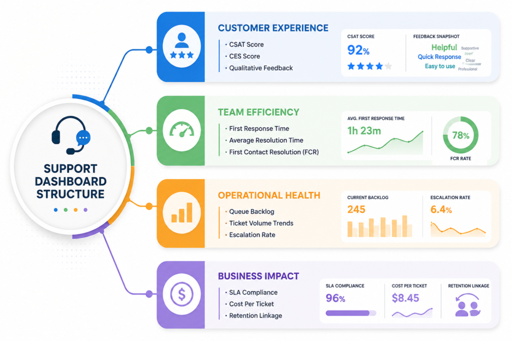
Selecting one or two key metrics per zone is more than enough for a clear executive view. Everything else belongs in a drill-down report opened only when a primary headline number shifts unexpectedly.
Mistakes That Make Support Metrics Less Useful
Tracking support data incorrectly leads to poor decision-making, distorted team incentives, and a degraded customer experience.
Tracking Too Many Metrics
Excessive reporting hides real operational failures under a mountain of data noise. Five or six metrics reviewed thoroughly will always beat twenty metrics reviewed casually.
Rewarding Speed Over Quality
Pressuring reps to hit aggressive response targets produces rushed, unhelpful replies and premature ticket closures. The unresolved work simply returns as a reopened ticket. The dashboard looks better temporarily, but the actual customer experience gets worse.
Ignoring Qualitative Feedback
Numeric scores indicate that something shifted, but verbatim comments tell you what actually broke. Skipping text feedback loses the contextual detail that explains the score.
Reviewing Reports Too Infrequently
Quarterly metric reviews move too slowly to fix emerging operational problems. Operational metrics require daily monitoring, while broad trend metrics need a disciplined weekly or monthly review cadence.
Measuring Agents Without Considering Ticket Complexity
Evaluating agents purely on raw ticket counts penalizes those who step up to handle complex technical issues. Volume must be weighted by difficulty, or the incentive structure will push agents toward cherry-picking easy tickets from the queue.
Treating Every KPI as Equally Important
Failing to establish clear metric priorities causes teams to optimize whichever number is most visible on the dashboard. Pick the two or three metrics that match your current growth stage and make it clear that the rest are supporting context.
Frequently Asked Questions
Which support metric is the most important for SaaS companies?
There is no single universal answer, but Customer Effort Score holds the strongest documented link to subscription retention. Research shows effort is a far better predictor of customer loyalty than basic satisfaction. If you track a second key metric alongside it, First Contact Resolution is the most practical choice, as research links every 1% improvement in FCR to roughly 1% better satisfaction and 1% lower operating costs.
How often should support metrics be reviewed?
First response times and queue backlogs should be reviewed daily, as both can be corrected immediately. CSAT scores, SLA compliance, and ticket categories require weekly review. High-level indicators like NPS, support cost per ticket, and churn correlation should be evaluated monthly, as shorter time windows yield sample sizes too small to interpret accurately.
What is a good first response time for SaaS support?
For email support, responding in 4 hours or less is considered strong, while 1 hour or less represents top-tier performance against a cross-company average of 12 hours. For live chat, the industry median sits around 1 minute 35 seconds, making anything under 2 minutes highly competitive. Enterprise SLAs commonly commit to 15 to 60 minutes for high-severity incidents.
Should startups track NPS from the beginning?
Generally, no. NPS requires a few hundred responses before the score becomes statistically stable, meaning small sample sizes produce wild swings month to month. Early-stage teams gain far more actionable value from CSAT scores, resolution times, and reading customer feedback directly. Collecting qualitative feedback is always worthwhile, but keep the numeric score off board presentations early on.
Which support metrics help reduce customer churn?
Customer Effort Score, ticket reopen rate, and recurring defect categories track most closely with subscription cancellation risk. High effort and repeated ticket reopens mean the customer is spending far more time fixing problems than expected. That friction usually manifests as account churn during renewal discussions.